Revit-i
Project: Revit-i
Role: Product Delivery, UX Design, UI Design
Duration: February 2022 - April 2022
Project Vision
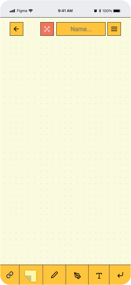
Revit-i is the next step for the The Good 'Reviting' Guide. Designed as a whiteboard-note style app it allows users to build upon The Guides information by adding their own notations and images. These can then be curated and shared as tips and tricks amongst other users to further the education of best Revit practices.
Challenges
1. Expand upon the Good Reviting Guide as interactive learning.
2. Bridge the gap in community learning and interaction.
3. Facilitate customisation and self driven user learning.
4. Maintain a recognisable style to maintain congruence.
Kickoff
Starting off, I asked myself a few initial questions. Who is our primary user? What kind of goals do they have? Why would someone want to use this application? Just how large of a scope do I want this project to be? After interviewing four participants to establish archetypes later on, it became evident that the goals they wanted to accomplish all fell within the same categories; finding out more about their Revit habits & identifying more of how they learn.
Competitive Analysis
In order to construct a concise and solid foundation for Reviti, I researched how current Revit education is taught and what user goals were not being addressed. I evaluated several features deemed vital from my user research and identified which ones Reviti could capitalize on to have a leg up over other resources.
Every single resource offers a disconnected "checklist" approach to learning. There was no feedback mechanism, and little community interaction outside of comments under the exercise posting. Lynda (LinkedIn Learning) provided a more fleshed out feedback mechanism, but that was a consequence of its connection to linkedIn.
Youtube creators provide alot of helpful information, but it is not customisable so you have to infer information. Lynda is too broad and dense to be engaging. Lynda and BIMscape provide the same education experience as the free resource Learningrevitonline.com
Prioritisation Plotting
Plotting a list of the possible features onto a graph helped narrow down what was absolutely crucial for delivering the mvp and what could be built upon further down the road. A big draw of using this application is to be able to share with others your learning process and tips and tricks. We can help users reach this goal by creating a public databse of searchable items which follow key terms.
Meet the Users
Primary
Name: ZoeAge: 23Occupation: Architecture StudentSecondary
Name: PhillipAge: 35Occupation: Associate ArchitectZoe is an architecture student who is still new to Revit and learning its ins and outs. She finds current learning sources tedious without hands on applications. She wants to be able to learn in her free time but feels bored by the prospect. Phillip is an associate architect who spends his time managing projects as well as documenting in Revit. He is very busy so has little time for extracurricular learning. He often asks around him for people to help. User Goals
I started the project by affinity mapping out important parts of the site and what their purposes are to better understand how the users will flow through the application. Information Architecture
Building on the affinity mapping, I further analysed the different pages and their navigation and flows between spaces. P&P Wireframing
Before moving onto high fidelity wireframes and mocks, I wanted to get a feel for what the core of the app would look like when put in front of me.Wireflows
Scroll through The GuideSelect "Link page"Create a new whiteboard or paste to existingAdd notes and other information!Challenge 1Expand upon the Good Reviting Guide as interactive learning.
The main function of this app is to expand upon the Good Reviting Guide. In order to do that I belived that creating an interactive learning process was key. My approach was to enable users to customise the experience, and share it with others in a community database. This lets them expand upon their learning and get a more rewarding experience through feedback and advice. Challenge 2Bridge the gap in community learning and interaction.
The main function of this app is to expand upon the Good Reviting Guide. This meant a key feature would be adding notation to The Guide. I decided the best feature for this would be a whiteboard space, where people can add notes, images, and sketch out ideas and explanations for themselves. Challenge 3Facilitate customisation and self driven user learning.
The main function of this app is to expand upon the Good Reviting Guide. This meant a key feature would be adding notation to The Guide. I decided the best feature for this would be a whiteboard space, where people can add notes, images, and sketch out ideas and explanations for themselves. Challenge 4Maintain a recognisable style to maintain congruence.
As an extension of The Good Reviting Guide, this app needed to maintain an aesthetic without sacrificing functionality and clarity. Below is the Style Guide used.Style Guide
Takeaway
This was my first product design challenge. I learnt alot and it was challenging working out the prototyping and design process, but i am happy with the result. I believe this would work better as a desktop application, because then screenshots can be taken straight into the app. However the point of the GRG was to have flexibility in viewing, so an extension of it needs to be a mobile app. 


